

You're already in the moment: a backpack is half-zipped, a birthday gift is wrapped, and someone is asking whether the water bottle belongs to your child or the other one with the same blue cup. That's exactly where personalized gift labels earn their keep. They're not just decorative. In busy homes, daycare rooms, and school drop-off lines, they're the small tool that keeps good intentions from turning into lost items, awkward mix-ups, and one more thing you have to replace.
Why a Simple Label Is Your Secret Weapon
A child's party table tells the story fast. Bright wrapping paper, a stack of similar-looking presents, and parents trying to remember which gift belongs to which child. A neat tag does more than look finished, it keeps the whole pile readable in seconds. That matters because the global personalized gifts market is projected to grow from USD 34.03 billion in 2026 to USD 61.66 billion by 2035, which shows personalization isn't a niche craft, it's mainstream demand for practical items like labels used in daycare, school, and family gifting. Business Research Insights
At the same time, a label's core purpose is simpler than often assumed. It needs to tell a caregiver, teacher, or relative what something is, who it belongs to, and where it should go back when the day gets chaotic. That's why a label with clear names and easy-to-read formatting often works better than one stuffed with extra decoration.
If you want the gift itself to feel more premium, pairing a clean label with thoughtful wrapping helps. Cedar & Lily Clothier has a useful roundup of luxury gift wrapping ideas that makes the presentation feel intentional without making the tag compete for attention. For everyday family gifting, the same principle applies to personalized adhesive labels, which are often most useful when they're simple enough to read at a glance.
Practical rule: if a tag takes more than a second to identify, it's not helping in a shared pile.
In real life, the best label is the one that survives being handled by tired adults and curious kids. That means clarity first, prettiness second, and durability always somewhere in the decision. Once you start thinking that way, labels stop feeling like an extra and start acting like a small system that saves time every week.
Choosing the Right Label Material and Type
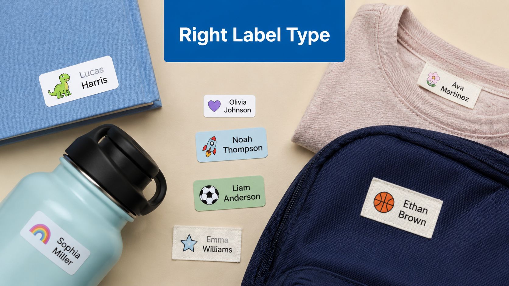
The right label depends on where it's going, how often it'll be touched, and whether anyone expects it to survive a wash. A paper sticker can work on a wrapped present or a book that stays dry. Put that same paper sticker on a lunch container, and you'll usually be re-labeling soon.
For repeated washing and handling, industry guidance points to polyester (PET) face-stock, a permanent acrylic adhesive, and a UV-blocking over-laminate for long-term legibility. That same guidance also ties ≥1500 hours in ASTM G154 Cycle 1 to several years of readable service in different climates, along with abrasion testing that can go up to 50 cycles. Durable Labels guidance
Match the format to the object
A few simple rules keep the decision easy:
- Water bottles and lunch containers: use a durable, wash-resistant adhesive label or a bottle band that can handle repeated cleaning.
- Clothing: use tags made for fabric, such as iron-on or press-and-stick options designed for laundry.
- Books, toy bins, and wrapped gifts: standard adhesive labels usually work well if the surface stays dry and flat.
- Sippy cups and bottles with lots of curves: flexible labeling often holds better than a stiff sticker because it bends with the surface.
Curved or soft surfaces are where people get into trouble. A label may look perfect on day one, then start lifting at the edges after a few uses because the shape never gave the adhesive a fair chance.
For families who want a dishwashing-ready option, the product details on dishwasher-safe name labels are worth reading alongside any material choice. One option in the market is InchBug's Orbit Labels, which are reusable bottle bands made for kid gear. That matters most when a bottle goes from lunch bag to dishwasher to daycare shelf without much downtime.
A label doesn't fail because the name was wrong. It usually fails because the material and the surface were mismatched from the start.
Think about the item's life, not just its look. If it's going to be scrubbed, bent, frozen, or handled every day, choose a format built for that environment. If it's going to live on a gift bag or a holiday box, you can prioritize appearance more freely.
Designing Labels That Are Fun and Functional
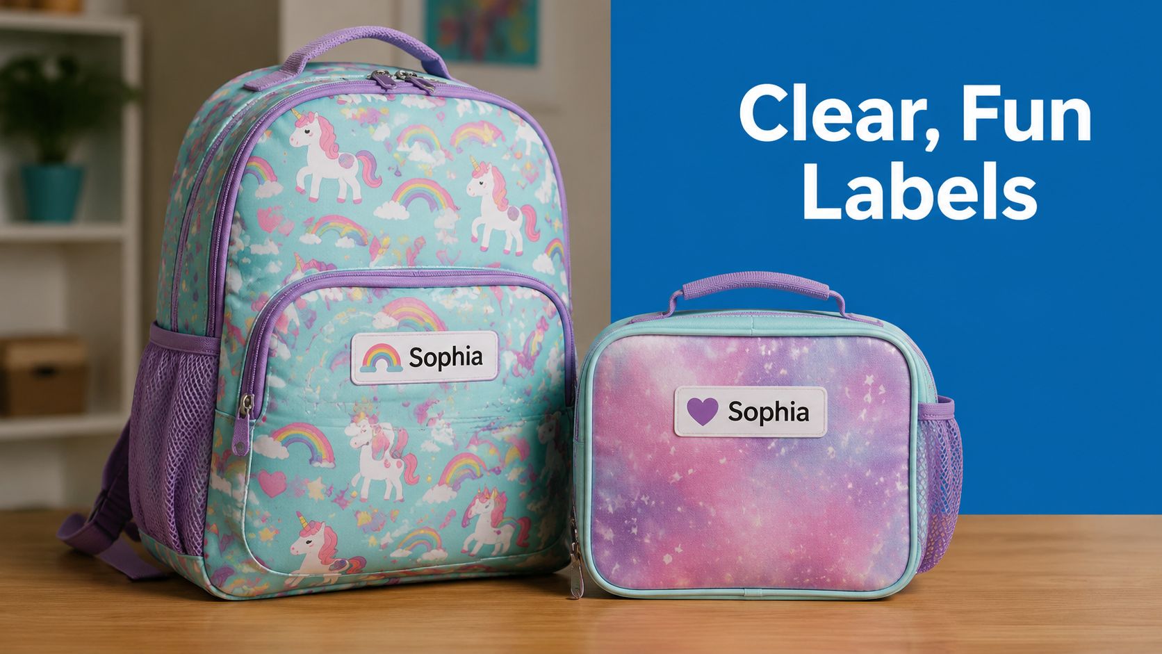
A good label should be readable from a few feet away and still make sense when a teacher is scanning a cubby full of similar items. That means bold, simple fonts usually beat script-heavy styles, especially for younger kids and caregivers moving quickly. If a child can start recognizing their own name, even better, but adults still need to read it fast.
The strongest designs usually keep the name as the hero. Icons help too, especially for children who aren't reading yet. A dinosaur, star, heart, or tiny truck gives a pre-reader a visual cue that feels personal without crowding the label.
Color contrast matters more than is commonly realized. A pale font on a pale background looks stylish until the lunchbox is buried in a backpack pocket. Dark text on a light label, or a strong-colored name on a clean neutral background, usually holds up better in real use.
Keep the design busy only where it helps
The trick is not to make the label “cute” in every available inch. It's to make it instantly recognizable.
- Use one main font: two type styles are usually enough, and more can get messy fast.
- Choose one icon: a single symbol gives the label personality without stealing space from the name.
- Leave breathing room: margins matter because crowded labels are harder to read and often look cluttered on curved items.
A simple design also helps when multiple adults touch the same item. Teachers, grandparents, daycare staff, and babysitters all read differently and at different speeds. A label that works for all of them is the one that doesn't make anyone squint.
For more layout ideas, the label design ideas guide is a useful reference when you're deciding between playful and plain. The best takeaway is simple. Choose the version that reads cleanly after a long day, because that's the version people will use.
Perfect Sizing and Placement for Any Gift
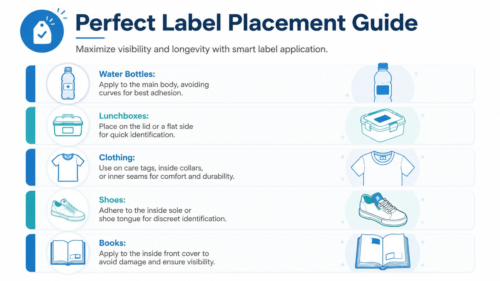
A label can be perfectly designed and still fail if it's too big for the surface or tucked where nobody sees it. Size should fit the object, not dominate it. On curved items, oversized labels wrinkle sooner, and wrinkling usually shortens the useful life of the adhesive.
The placement rule I use is plain: put the label where hands won't constantly rub it off, but where adults can still find it quickly. That usually means a flat or gently curved area, not a seam, fold, or edge. The more often an item is washed or dropped into a bin, the more careful the placement needs to be.
Placement that works in the real world
- Water bottles: apply to the main body and avoid the strongest curve so the label stays flat.
- Lunchboxes: use the lid or a flat side so staff can identify it at a glance.
- Clothing: put labels on care tags, inside collars, or inner seams for comfort and durability.
- Shoes: use the inside sole or shoe tongue for discreet identification.
- Books: place labels inside the front cover so they stay visible without damaging the outside.
That approach also lines up with practical sizing guidance in the name tag label size resource, which is especially helpful when you're moving between tiny items and bulky gear. Bigger isn't always better. A label that fits cleanly usually survives longer than one that tries to cover too much surface.
Useful shortcut: if you can't imagine a teacher seeing it at a glance, move it to a flatter or more visible spot.
Placement also affects how fast a child can identify their own stuff. A backpack tag on the back panel might look tidy, but a label near the opening or front pocket often gets used more. The goal is never just to label the item. It's to make the item easy to return to the right child without a second thought.
Wording Templates for Common Occasions
A strong label doesn't need a lot of words. In a classroom gift exchange or a pile of sibling presents, immediate recognition matters more than a clever phrase. That's consistent with the idea that tags should reduce sorting friction, not compete with the gift itself. Hammont
For birthday gifts, a short line keeps everything clear:
- Happy Birthday, Leo! From the Jacksons
- For Mia, with love from Grandma
- A little something for Noah
For holidays, the message can stay warm and still be easy to scan:
- Merry Christmas, Sofia. Love, Uncle Ben
- Happy Hanukkah, Eli. From Aunt Rachel
- Season's greetings for the Patel family
For baby showers or new-baby gifts, the wording can carry both sentiment and utility:
- A little something for Baby Smith
- Welcome, Baby Nora. Love, Aunt Kate
- For the nursery, from the Johnsons
For items that need to come back home, use labels that do a little more work. Add a phone number only when it makes sense for the item and the setting, and keep allergy or safety notes direct and visible. A lunchbox tag might say, This lunchbox belongs to Ava. Allergy note inside, while a bag tag might say, If found, please call this number.
Keep the text short enough to read fast
A common mistake is writing too much. A gift tag isn't a note card, and a gear label isn't a greeting letter. If the wording starts to feel crowded, cut it back until the main name or instruction pops immediately.
A few well-chosen templates are usually enough for most families. Once you have a style that works for daycare, school birthdays, and holidays, you can reuse it with small edits instead of starting over every time.
Pro Tips for Ordering Application and Care
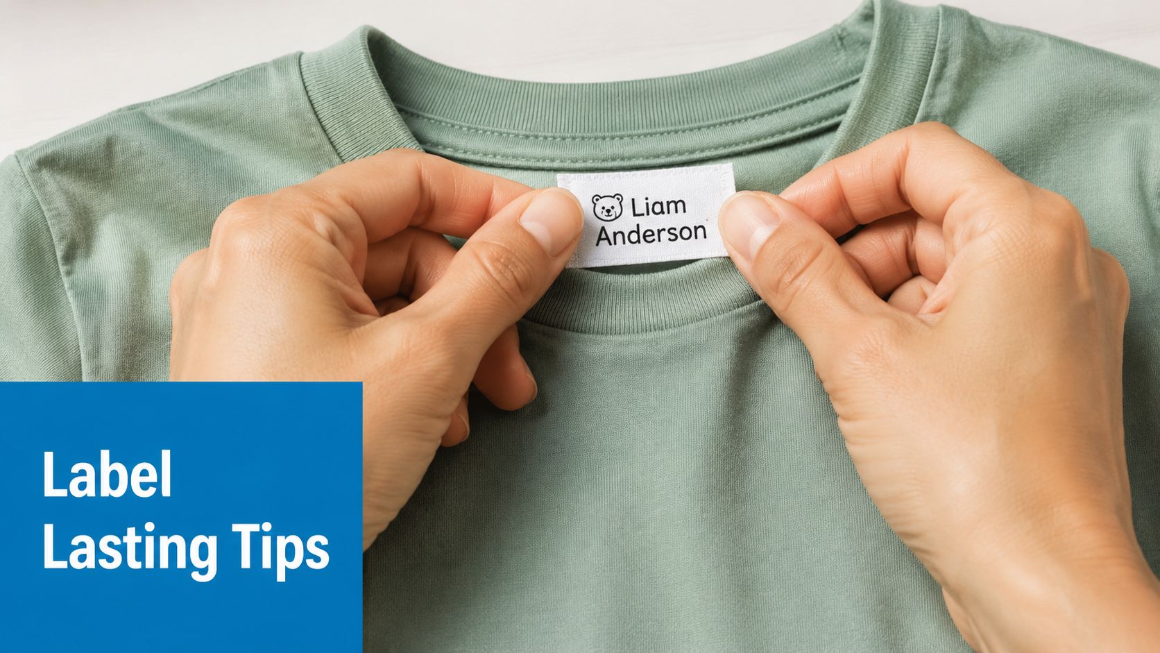
The labels that last are usually the ones that were ordered and applied with care. I always check spelling twice, especially on names that are easy to miss in a rush, and I like buying combo packs when I know I'm labeling bottles, lunch gear, shoes, and clothing all at once. Bulk buys only help if the label types match the things you're labeling.
Clean application matters just as much as the order itself. The adhesive needs a clean, dry surface, and it needs pressure to bond properly. The validation workflow in the label testing guidance recommends applying samples to the intended substrate and then letting the adhesive cure for 24–72 hours before washing or abrasion exposure. IOPP label qualification plan
A simple care routine keeps the label readable
A practical routine saves a lot of replacement work:
- Wipe surfaces first: moisture, crumbs, and lotion residue can weaken adhesion.
- Press firmly: especially along edges, where lifting often starts.
- Let it set: don't rush the first wash or heavy handling.
- Check wear points: corners, seams, and curved edges are usually the first places to fail.
For more application detail, the label application methods guide is a useful companion when you're putting labels on different kid items. The biggest mistake I see is treating application like a last-minute sticker job. It's not. It's the part that determines whether the label works next week.
Good habit: label the item before it enters the school bag, not after it's already been through one busy day.
“Dishwasher-safe” and “laundry-safe” only matter if the label type was made for that environment and applied correctly. Once a family gets into the rhythm of labeling before the chaos starts, lost bottles, mixed-up shoes, and mystery jackets become much less common.
If you're trying to get ahead of daycare chaos, start with the items that disappear most often, bottles, lunch containers, shoes, and clothing tags. Pick a label style that fits each surface, keep the wording short, and apply everything before the first busy morning arrives. If you want a straightforward place to compare personalized options for kids' gear, visit InchBug and choose the labels that match the way your family uses them.