

You're reviewing a children's label proof when a black line horizontal suddenly appears across the name field. At first, it looks like a deliberate divider. Then you print the sheet, and the line is still there, or worse, it repeats down every label. The same visual element can be either an excellent design tool or a costly production defect, depending on where it appears and whether you intended it.
For parents, teachers, and product designers, the practical skill is knowing the difference. A clean horizontal rule can make a daycare label easier to scan, while an accidental line may point to a failing printer component or a damaged display panel. Good results come from treating design, proofing, and production as one connected workflow.
The Power of Simple Lines in Kids Label Design
A parent sorting daycare gear rarely has time to study each item. A water bottle sits beside a lunch box, a jacket is mixed with several similar jackets, and an allergy alert needs to be recognized without hesitation. If the label uses decorative borders, multiple type styles, and competing icons, the child's name can disappear into the artwork.
A black horizontal line gives the eye a stopping point. Place it beneath the name, above a secondary detail, or between a first name and an allergy message, and the label gains structure without adding another visual character. The line doesn't need to be the most noticeable element. Its job is to organize the elements that matter.
Consider a lunch-box label with a child's name at the top and a small classroom identifier below. A dense patterned border may compete with both lines of text. A restrained divider creates separation while keeping the name dominant. On a shoe identifier, the same principle helps distinguish the child's name from a small directional cue or icon.
Why restraint works in busy environments
Children's products often use bright colors and playful illustrations. Those features can make an item feel personal, but they also increase visual noise. A simple rule introduces contrast and rhythm, especially when the background contains characters, confetti, or textured color.
- Use one primary hierarchy: Make the child's name the strongest element, then use the line to support secondary information.
- Keep the divider subordinate: A line that's too heavy can split the label into two unrelated blocks.
- Align with the text: A divider that starts and ends at inconsistent points can make the design look accidental.
- Protect the message: Leave breathing room between the line and nearby letters so the divider doesn't touch descenders or small icons.
Practical rule: If removing the line makes the label harder to scan, it has a structural purpose. If removing it changes nothing, it may only be decoration.
The best reference points aren't limited to packaging. Tattoo artists, poster designers, and interface designers all use horizontal geometry to control movement across a surface. Designers exploring linear compositions can browse horizontal tattoo concepts to see how a single directional element can create balance without filling the entire canvas.
For children's labels, the same discipline supports personalization. Before exporting artwork, compare the layout against practical label design ideas, especially if the label needs to work on curved bottles, narrow clothing tags, or small shoe surfaces.
From Modern Art to Mass Market Design Assets
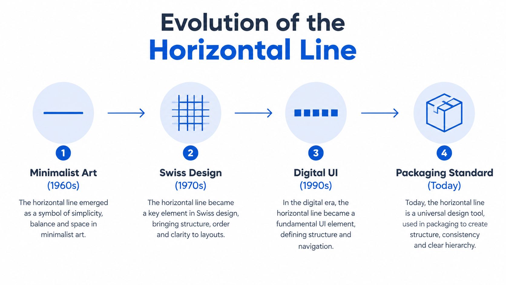
The black line horizontal has a deeper design history than its apparent simplicity suggests. The Fondation Beyeler describes Piet Mondrian's development of Neoplasticism from around 1920, including a later phase in which his grid lines became wider, more dominant, and exclusively black, as documented through the historical reference on black horizontal line art. That shift helped establish the line as a structural component rather than merely an outline.
Mondrian's work between 1917 and 1920 already used a dense modular grid, but the later combination of strong black lines and primary colors became the visual language most closely associated with his mature abstraction, according to the same reference. In practical design terms, the lesson is clear: a line can define relationships between shapes, spaces, and information without illustrating an object.
From gallery language to packaging language
Modern graphic design adopted that reduced vocabulary because it works across formats. A line can separate a product name from instructions, establish a baseline for icons, or make a small panel feel orderly. It also translates cleanly into print and digital interfaces, provided the designer controls thickness, spacing, and contrast.
The commercial asset market reflects how standardized this primitive has become. One stock-vector platform lists 18,962,452 horizontal line vector graphics, while another image library lists 1,824 black horizontal line image collections and templates, as reported by black horizontal line image resources. These figures don't mean every asset is useful. They show that horizontal rules are embedded in contemporary design workflows.
Standardization creates both speed and risk
A ready-made line graphic can accelerate a packaging project, but it can also bring problems. Some assets contain unnecessary outlines, embedded effects, or inconsistent endpoints. Others are built at a scale that looks crisp on a large artboard but fills in when reduced for a small label.
A product designer should treat the line as a system component, not an ornament. Define how it relates to the label edge, text block, color field, and trim area. If multiple products share a family design, keep those relationships consistent while adapting the line to each physical format.
AI-assisted workflows can help generate and compare variations, but human review remains essential. A resource on Genpire product design can be useful when exploring alternatives, but the final decision should come from actual label dimensions, print behavior, and readability testing.
Sizing and Contrast Guidelines for Daycare Labels
A horizontal divider earns its place only when people can see it without mistaking it for a border, scratch, or print failure. On a daycare label, the line must coexist with a child's name, a colorful background, and the wear caused by handling, washing, or dishwashing. The safest approach is to design the line as a controlled visual weight rather than choosing a thickness by appearance alone.
Start with the smallest application. A line that looks balanced on a large bottle label may become too dominant on a shoe identifier. Reduce the line's visual weight as the available space narrows, and keep enough separation between the divider and the text to prevent the letters from visually merging with it.
Build the line around the label hierarchy
Use this sequence when preparing artwork:
- Set the name first: Establish the largest and clearest text before adding decoration.
- Place the divider second: Position it where it separates information, not where it merely fills empty space.
- Check the surrounding color: Black provides strong contrast on pale backgrounds, but it can feel harsh against saturated colors.
- Inspect at production size: Review the label at its intended physical scale, not only while zoomed into the design file.
- Test the smallest text nearby: A line can draw attention to weak type, but it can't rescue lettering that's too small or too decorative.
The divider should usually be shorter than the full label width when the design contains a name block. That creates margins and prevents the line from reading as a cut edge. A full-width rule can work on a deliberately modular label, but it needs consistent alignment with other full-width elements.

Contrast must survive real use
Screen contrast isn't the same as physical contrast. Glossy surfaces, curved bottles, fabric texture, and low classroom lighting can all reduce clarity. A vivid background may look attractive in a proof but make a thin black rule difficult to distinguish after printing.
Production check: View the proof on the actual type of surface whenever possible. A flat digital preview can't show how a line behaves around a bottle curve or across woven fabric.
Keep the line away from trim edges and likely scuff zones. For clothing labels, avoid placing important text so close to the divider that repeated washing could make the two elements appear joined. The practical guidance in font size advice for labels can help you evaluate the text that the line is meant to organize.
Identifying Accidental Lines in Laser Printing
An intentional divider has a predictable relationship to the label artwork. It appears in the same designed position, follows the file geometry, and ends where the layout says it should end. A printer defect behaves differently. It may extend beyond the artwork, cross several labels, change density, or repeat at a fixed distance down the page.
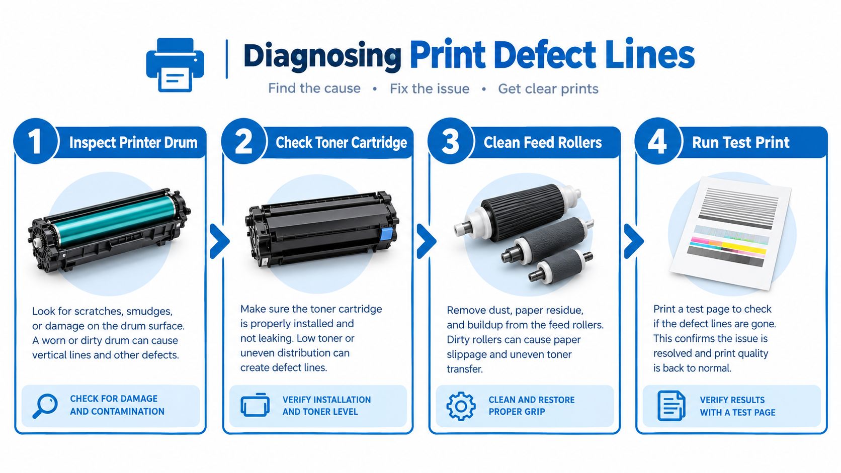
Laser printers create these defects through the imaging path, not through the design file. Service guidance identifies repeat intervals such as 32 mm, 38 mm, 53 mm, or 76 mm as useful clues when diagnosing rotating components, including the cartridge, drum, charger roller, fuser, or related scanner and engine assemblies, as explained in this laser print-quality troubleshooting guide.
Compare the line, don't just look at it
Print a clean test page using a different document. If the black line remains in the same position relative to the paper, suspect the printer. If it appears only in the label file, inspect the artwork, linked graphics, clipping masks, and exported PDF.
Next, measure the distance between repeated lines. A constant pitch points toward a rotating or feed-cycle component. A line that appears once, disappears, and returns unpredictably may require a different inspection path.
| Observation | More likely direction | Useful next action |
|---|---|---|
| Line repeats at a constant pitch | Imaging or rotating component | Inspect the drum and cartridge first |
| Line crosses the whole sheet | Printer path or transfer system | Run a plain-page test |
| Line follows only one artwork element | File or layout issue | Inspect the source file and export |
| Line changes after cartridge handling | Cartridge or drum path | Re-seat or replace the relevant unit |
Start with the drum unit because it can transfer a repeating mark across multiple pages. If cleaning or replacement doesn't resolve the defect, inspect the transfer belt, scanner assembly, fuser, and controller path. Avoid consuming a full label run as a test. Use plain paper first, then a small proof sheet once the output is clean.
Printer maintenance and toner handling can vary by model. If you're working with a Brother device, review the specific Brother printer toner reset guidance before assuming a reset will solve a physical imaging defect. A software reset can clear a status message, but it won't repair a damaged drum or contaminated transfer surface.
Troubleshooting Digital Previews and Screen Displays
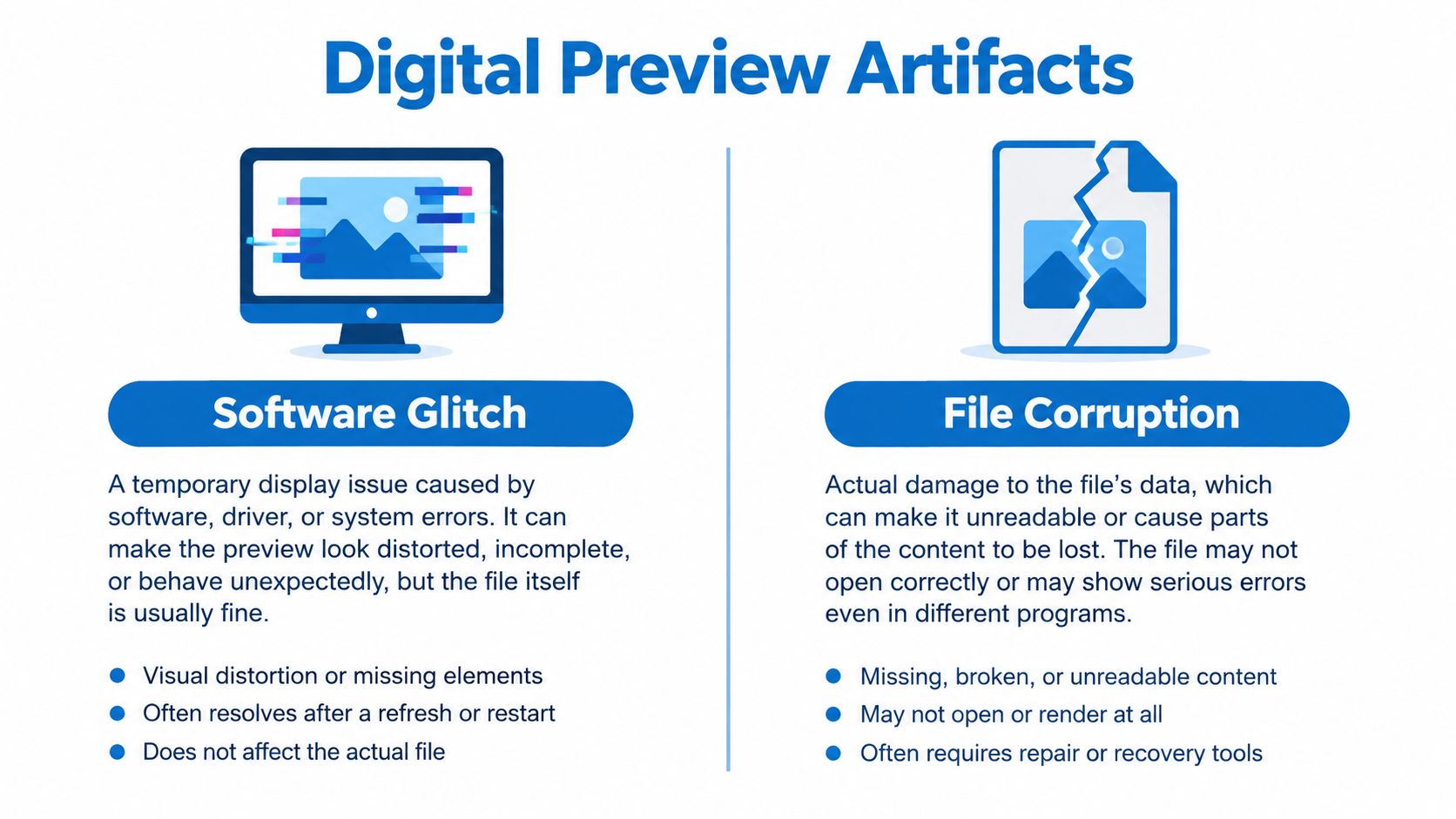
A line in a digital proof creates a different diagnostic problem because the screen can introduce artifacts before the file ever reaches the printer. The fastest way to separate file behavior from panel behavior is to capture a screenshot.
If the line appears in the screenshot, the rendered image, application, graphics pipeline, or file may be responsible. If the screenshot is clean while the physical display still shows the line, the issue is more likely inside the screen assembly, cable, connector, or display logic.
Use the screenshot fork first
Open the same proof in another application or on another display. Then capture the screen while the line is visible. This produces a practical decision tree:
- Visible in the screenshot: Check the artwork, PDF export, browser rendering, graphics driver, or GPU behavior.
- Absent from the screenshot: Check the laptop or monitor panel, cable path, connector, and hinge area.
- Visible only at startup or in BIOS: Suspect hardware more strongly, because the operating system and design application aren't yet controlling the display.
- Changes when the lid or cable moves: Treat signal integrity, cable wear, or connector seating as a priority.
- Stays fixed while content changes: Suspect a panel-side row failure or timing path issue.
A persistent horizontal line in an LCD or laptop display can result from failed row-driver circuitry, damaged tab bonds, or a defective T-Con or timing path, according to this laptop screen black-line diagnostic guide. A line that remains in exactly the same location across different content is especially important because it points away from the label file.
Intermittent behavior needs a separate test
Not every display fault is permanently visible. Some lines flicker at particular brightness levels, during dark scenes, or after the laptop lid moves. Refresh-rate settings can also complicate the picture. Recent troubleshooting guidance emphasizes comparing behavior under motion, brightness, startup conditions, and cable movement rather than treating every line as an immediate panel replacement, as summarized by black-line display troubleshooting guidance.
For a label workflow, don't approve or reject artwork from one monitor alone. Export the proof, inspect it in a separate viewer, print a small physical sample, and compare the physical output with the file. A label-making application such as the one described in this label maker app resource can simplify personalization, but the screenshot test still matters when an unexpected artifact appears.
Your Final Checklist for Flawless Label Production
A dependable label workflow separates three questions: Is the line intentional? Is it readable? Does the output match the approved file? Answer those questions in order, and most expensive mistakes become easier to catch before a full run.
Begin with the design itself. Open the source file and identify every horizontal rule. Confirm that each one has a purpose, such as separating the name from an allergy message or creating a consistent boundary between information groups. Remove stray vectors, duplicated objects, and hidden layers before exporting.
Approve the visual system
Use this design review before sending artwork to production:
- Hierarchy: The child's name should remain the first element a teacher or parent notices.
- Spacing: Keep letters, icons, and the divider visually separate.
- Contrast: Check the line against the actual background color, not a placeholder white artboard.
- Scale: Inspect the smallest label format at physical size.
- Consistency: Use matching line alignment and treatment across bottles, bags, shoes, and clothing tags where the products belong to one set.
A useful comparison is live event graphics. A touring drummer may evaluate a custom bass drum head from a distance, where a bold mark must remain legible without becoming cluttered. The same distance-first thinking appears in this guide for touring drummers, even though the production surface and audience differ.
Proof the file and the equipment
Export a proof in the format requested by the printer, then open it in another viewer. Capture a screenshot if a line appears on screen. If the screenshot is clean, inspect the display rather than changing the artwork. If the line appears in the file, return to the source layout and examine objects, masks, and export settings.
Print a small proof on plain paper before using adhesive label stock. Look for lines that extend beyond the intended design, vary in density, or repeat at a fixed distance. Those signs point to the printer's imaging path, so pause production and inspect the drum, cartridge, transfer path, and fuser.
Finally, review the finished label after handling and washing. Follow the applicable label care instructions so the line, text, and background receive the treatment they were designed to withstand. A final check should confirm not only that the line looks good on day one, but also that it doesn't interfere with the information a child's caregiver needs.
Choose InchBug when you need personalized labels and kid-friendly identification products designed for everyday daycare and school gear. Review your line placement, name hierarchy, and proof before ordering, then use a durable label format that keeps bottles, lunch boxes, clothing, shoes, and bags easier to identify.